Dear Reader,
It has been too long since I was creating in my studio (a week). In fact there was a mess of stamps to clean from my last session before I could create in my square foot space among the clutter of supplies. I have found that even though I am a mess, I can use my mess to my advantage at times. I often will use what is about me--leftover paper, stamps, inks and even packaging at times.
Having said that my studio isn't entirely a den of chaos. There is order underlying the seeming disaster. I have categorized and placed my products and tools in certain zones, but my tables always seem to be covered with stamps, papers and the like. I like having my main tools at hand. As my tables dominate the room, I have to keep apologizing for how it looks to family and friends. My mom is especially critical of my studio as her sewing room is an example of organized crafting. I do love the look of an extremely organized art space, I just don't create well within it.
What about you? Does order constrain or free you to create? Do you like a balance of both?
Anyway, back to last night's creating. I wanted to create some more cards for the Clean & Simple Card Making class. This time I made a card using Jennifer McGuire's lessons from Day 3 and Day 5.
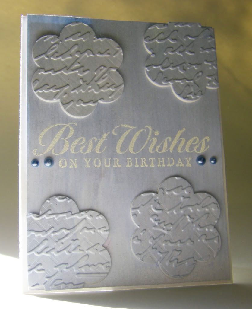
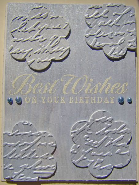
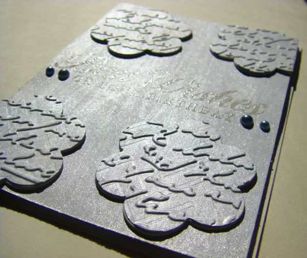
For Day 3 I chose to go with a simple die cut shape from Papertrey Ink called Friendly Flower. I cut out numerous flowers from white cardstock to be used as layering under the top flower (I used four under each blue flower). I had an idea of embossing the top dies to give them texture and further interest. The blue paper I used was actually paper I had created using some shimmery blue acrylic paint several years ago and was just sitting in my stash waiting to be used. I thought the shimmer along with brush strokes would add interest to this simple card. The sentiment is a favorite of mine from Hero Arts' Friends are Treasures set. I simply embossed that with white embossing powder and added a few pearls to set it off.
Another view with a pretty good representation of the color:
I think you can see some of the shimmer here and the dimension (you can also see the subtle zig zag impression under the script embossing):
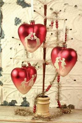
For Day 5 I did a loose interpretation of Jennifer McGuire's watercolor blocking technique as I was inspired by heart ornaments we have hanging off our chandelier that we bought from Victorian Trading Company. They have an ombred background with white glittered silhouettes over it.
Here is the inspiration (picture from Victorian Trading Company):
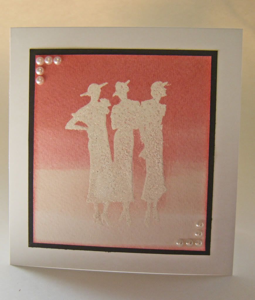
The card:
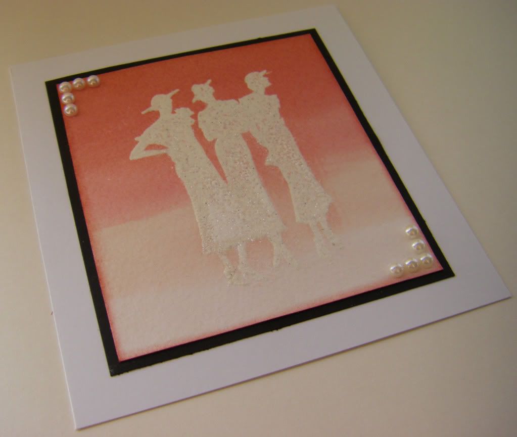
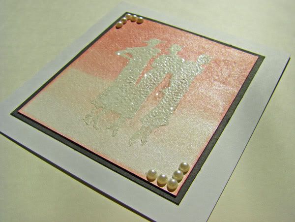
I stamped the silhouette (Silhouette Women by Hero Arts) with Versamark ink onto watercolor paper. I thought I would try using a sparkly embossing powder with a touch of white to get a glitter effect, but I am not thrilled with the coverage. I later added some glitter over the women. In the future I would probably just emboss in white and add the glitter by using a glue pad over the embossed image. After embossing, I painted bands of color from lightest to darkest (spun sugar, tattered rose, worn lipstick and fired brick) using Tim Holtz Distress Ink. I smudged the ink directly onto my craft sheet, sprayed a little water and then one spritz of Studio Calico Mister Huey's Calico Shine onto the ink and painted it on. I edged the watercolor paper panel and matted it on a little black and added the pearl corners.
This picture is closer to the colors on the actual card, but still a bit off:
Showing some of the shimmer and glitter:
Happy creating,
Shay.
{best wishes birthday card}
stamp: Friends are Treasures (CG277), Hero Arts
ink: Versamark, Tsukineko
embossing powder: opaque white, Judi Kins
cardstock: white, Georgia Pacific
die: friendly flower, Papertrey Ink
embossing folders/plates: script, cuttlebug by Provo Craft; Halloween letterpress printing plate, Lifestyle Crafts
other: denim pearls, Kaisercraft; acrylic paint; cuttlebug, Provo Craft
{ombre women card}
stamp: silhouette women (CG278), Hero Arts
ink: fired brick, worn lipstick, tattered rose and spun sugar, Tim Holtz Distress Ink by Ranger; Versamark, Tsukineko
embossing powder: polysparkle, Ranger; opaque white, Judi Kins
watercolor paper: cold press, Strathmore
cardstock: white, Georgia Pacific; black from stash
spray: calico shine, Mister Huey's Color Mist by Studio Calico
other: crystal fine glitter, Martha Stewart Crafts; pearls, The Paper Studio
4 comments :
Shay,
I like your cards! The shimmer does show up in your pictures. That is one real problem I have with uploading pictures of cards that have a shimmer or glitter--I never can get a good upload. About working in chaos--my regular state of affairs. I try to have things organized, but I tend to "ransack" when I am trying to find things. I, too, work within 1 square foot of space as a rule! But on the bright side, at least I have that! I would rather be creating than cleaning!
Hi Shay! These are both beautiful! I really love your second card, those silhouettes look awesome against the stunning background you created! Glad to see that you are enjoying the class! I have a bit of catching up to do! As for the messy craft room, I'm always cleaning up, even when I think it's clean it's actually still a mess, there just does not seem to be a desk big enough!
Love these cards! You did a great job!! Hugs from Conroe, TX!
I'm so glad you posted some cards for the challenge. I think the silver metallic is impressive and unexpected and I love the cameo inspired card- very pretty. Bravo!
Post a Comment