Showing posts with label Basic Grey. Show all posts

July 15, 2013

Man Oh Man Monday No. 19 | Enjoy the Journey


Good evening! Using some chipboard pieces from the Fact & Fiction collections by Basic Grey along with some patterned paper from Fact by Basic Grey, some stamps from Basic Grey and Sn@p! Studio by Simple Stories and a new die (it also comes with cool stamps too) from 7Gypsies/Hampton Art/Sizzix I made this vaguely office-y/vintage card:


That's it for me for now.  Hope you have a joyous week.

Happy creating,
Shay.

Supplies:
Stamps: carbonated background, Basic Grey/Hero Arts; snapshots, sn@p! studio by Simple Stories
Ink: charcoal mid-tone, Hero Arts Shadow Ink; weather vane, Jenni Bowlin for Ranger
Cardstock: white, Georgia Pacific
Patterned paper: 6x6 paper pad from Fact collection, Basic Grey
Other: designer chipboard stickers from Fact & Fiction collections, Basic Grey; Gypsy Files Stamp & Die-cut (file die cut), 7Gypsies/Hampton Art/Sizzix; Cuttlebug, Provo Craft; sewing machine, Brother; tiny attacher, Tim Holtz; Crop-A-Dile Corner Chomper, We R Memory Keepers; dimensional adhesive

June 21, 2013

Dear Mama Elephant

Dear Mama Elephant:

How do you do it?  How do you make such cleverly designed stamp sets that are nearly impossible not to covet?  My bank account does not thank you one bit.  I do though.  How could I not?  You have an adorable typewriter that works for men and women which I used to make a simple birthday card for my younger (don't ask by how much) cousin who plans on becoming a writer.  Perfect?  Yes, indeed Type It was.  You can even just stamp it right on your cardstock with the little separate sheet of paper without losing one iota of its beauty.  I also love the little typed sentiments...happy b-day. and to you. are just right.   Let us not forget the ever useful, Trifecta because I certainly have not!  I reach for that baby when I want some filler without it being fussy and still trendy.

Any success of my card I contribute to your designs:


I am looking forward to inking up more of your stamps and adding to my growing collection (again angering my bank account).  Should you like to give me special sneaks of upcoming releases for a very biased reaction, don't hesitate to ask.  I am on it!

A fan,
Shay.

Supplies:
Stamps: Type It and Trifecetta, Mama Elephant
Ink: weather vane, Jenni Bowlin for Ranger; raspberry fizz, Papertrey Ink
Cardstock: white, Georgia Pacific; raspberry fizz, Papertrey Ink
Patterned paper: Soleil 6x6 paper pad, Basic Grey
Other: sequins, Studio Calico; pearls, The Paper Studio; doily

June 8, 2013

Dear Sassafras

Dear sassafras aka Tim and Beck:

How I love your unique designs full of vintage touches, quirkiness, humor and flamboyant color combinations.  I find your products beautiful, intriguing and fun to use (I don't like to play favorites, but Sunshine Broadcast is one of my all time most beloved collections *ever*).  Case in point, Soleil which you designed in collaboration with Basic Grey last year (it happens to be on sale on Basic Grey's website right now).  I love it.  I love it even more today than I did when I first saw it displayed on my computed screen on Basic Grey's blog when they unveiled their Summer CHA 2012 collections.  And I love that I can mix in a stamped flower I had sitting on my work table from a previous doomed card to create something wholly new for my friend's birthday.  I decided to let myself be free as your designs foster creative adventures.

Here's my card which was delightful to make, although I am not sure it does your designs justice:


I plan to use Soleil all over the place and if I could I would wallpaper my room in your paper.  That isn't much of a hyperbole....as I type it I am considering whether I could wallpaper a wall of my room with your paper, but I hate to wallpaper...the preparation, the glue that doesn't quite work or works too well, the air bubbles, arms raised for long moments above the head and most of all the thought of in the future when I may want to/have to change things removing said wallpaper.  Will you be disappointed if I don't wallpaper my room with your paper?  Instead I may just place your papers in frames to hang on the wall.

You are awesome.  I hope to see many more of your designs in the future (please!!!!), but until then I will be (not at all like a crazy person) fervently admiring (soon in frames) and occasionally even using my vintage sassafras stash.

A fan,
Shay.

By the way, if you want a chance to win some free art products including stamps this weekend, check out my Paper Wings Productions' Design Team Blog Hop post HERE.

Supplies:
Stamp: Funky Florals (limited edition), Papertrey Ink
Ink: harvest gold, Papertrey Ink; bubble gum, orange soda, stone wash, Hero Arts Shadow Ink
Cardstock: white, Georgia Pacific; piece of cardstock previously sprayed with mists
Patterned paper: Soleil 6x6 paper pad, Basic Grey
Other: tag sale #3 die collection, Papertrey Ink; Cuttlebug, Provo Craft; element stickers and title stickers from Soleil collection, Basic Grey; doily; dimensional adhesive; Inkssentials ink blending tool, Ranger

June 7, 2013

Paper Wings Productions' June Design Team Blog Hop


WELCOME to the “Summer Fun” Paper Wing Production's Design Team Blog Hop & Giveaway!  If you've arrived here from The Aviary, then you're in the right place.  If you’re just stopping by for a visit, I’d love for you to check out our hop...you will not be disappointed!  I am honored to be the first stop for this blog hop!

This month we’re sharing some “summer fun” themed projects.  So sit back, grab yourself something cold to drink or better yet some ice cream or frozen yogurt and enjoy a little Paper Wings Productions summer inspiration!  Oh and let’s not forget about the blog candy!!  This month we’re giving away a gift certificate to the Paper Wings Production’s online store AND there will be some blog candy along the way!!  
For a chance to win, all you need to do is:
  • be a follower of the Paper Wings Productions blog, The Aviary
  • visit each of the participating designer's blogs and leave them some love. Then go back to The Aviary and leave a comment letting them you completed the hop. 
  • to increase your chances of winning, like the Paper Wings Productions Facebook page and/or invite your friends to the hop. 
  • then just come back and let us know! Be sure to leave a separate comment for each of the additional entries. 
The winner will be announced on Tuesday, June 11th, 2013 on The Aviary.

When I was brainstorming ideas for Summer Fun, I hit upon one of my favorite ways to spend hours upon hours: reading.  I thought why not create a book cover to disguise those steamy paperbacks that are so much fun to read?  I know there are ebooks, but sometimes a good old fashioned book is just the thing poolside, on the beach, in a car, on the plane or sitting in the cool air conditioning.  


I started with Claudine Hellmuth's 8.5" x 11" sticky-back canvas thinking I would do some image transferring.  In the end though I used the sticky-back canvas like a big fabric sticker.

Here is what I did (big surprise this is pretty wordy):

I freehand drew a sun ray pattern on a cardstock panel which measured 8.5 inches high by 4.25 inches wide (in the end the project ended up being 8 inches high as I didn't need as much height).  I numbered each of the parts and then cut them out (I cut each shape out twice as I made two panels for the front and back).  I used those pieces as patterns to trace onto pieces of patterned paper from the Basic Grey|Sassafras Soleil collection.  


I stamped the sun from Earth and Sky or Sunrise and a line from Window using yellow ink onto the half circle shape.  The largest center ray piece I stamped over with the Backgrounds or Circles background and Writing Backgrounds or Writing stamps.  I adhered (using some liquid glue) each sun and its ray to a piece of cardstock measuring 8.5 x 4.25 inches using the numbers from the pattern pieces as guides.  Don't worry if things aren't perfect because you are looking for a handmade mismatched look anyway.    

On the piece of sticky back canvas, I measured 0.5 inches on each of the right and left sides to be folded over as flaps to fold into the book to keep the book cover over the book.  I actually cut two one inch wide strips from patterned paper for these sections.  I measured for center and decided to create an inch wide spine that I then cut out from patterned paper.  Removing the backing to the sticky-back canvas and with the sticky side up, I placed the center strip at 5 inches (it will then take up the place of 5 inches to 6 inches on the canvas).  The panel I wanted as the front cover I placed on the right side butting up next to the center/spine 1 inch strip of patterned paper. I placed a one inch strip to the right side of the front panel.  Next I placed the back panel to the left of the center strip and finished off by adding the last one inch strip to the left of the back panel.  I lined up the panels to the bottom of the sticky-back canvas as any cutting I would be doing would be to the top of the canvas.  Happy with the placement, I used a bone folder to burnish the paper onto the canvas.  I cut any overhang of paper from the canvas and added some strips of brown sugar glitter tape on the spine for more interest. 

Then I actually got out the sewing machine.  This should garner a response of shock and awe as the sewing machine and I have a very peppered past.  Anyone aware of my sewing abilities knows I have a much better relationship with the seam ripper.  I want to assure you that I was very pleasantly surprised by how easy it was to sew on this project. If I can do it, ANYONE can do it!  I went to town sewing all over the canvas.  Have fun trying different color thread, different stitches, free style stitching as this is the perfect type of project to play with the sewing machine or if you are able and willing hand stitching.  


Next I stamped "here comes the" from Funky Lower Case Alphabet with blue/purple ink on white cardstock.  I cut out each letter as little blocks not worrying about size or straight lines.  Then I stamped "sun" using Funky Alphabet (the uppercase version) in yellow ink and cut out the entire word as one block.  I used a little liquid glue to adhere each letter to the front panel.  I placed a strip of brown sugar glitter tape down under the sun block.  I then sewed across each word.


At this point you can add more stamping, sewing, painting, doodling, embellishments or not.  When you are happy with it, I recommend for more durability painting on a few layers of modge podge or soft gel medium to seal the piece. 


This book cover will fit those odd long paperbacks or a paperback of around 350 pages.  I think that if you used a 12x12 inch piece of sticky-back canvas or used more than one 8.5 x 11 inch sheet you could make a wider book cover for thicker books or even one that fit trade paperbacks and/or hardcover books.  This would be fun to make again and the possibilities are endless on how you could decorate it! 


Now you can hide that guilty pleasure of a book (Fabio-like men hidden from prying eyes) behind your artsy book cover or give one to a friend with a book or books and/or gift card as a considerate gift.  If you try out this idea, please let know because I would *love* to see it!

Now, make sure you check out each and every stop on the hop starting with the very talented lady that makes all things Paper Wings Productions possible, Carrie Avery.

***Here is the complete line up just in case you get lost along the way***

It has been an absolute delight to have you visit me today and I hope this helps kick start an amazingly creative and fun summer!

Happy creating,
Shay.

Supplies:
Stamps:

Ink: squeezed lemonade, scattered straw, wild honey, dried marigold and worn lipstick, Tim Holtz Distress Ink by Ranger; butter bar and stone wash, Hero Arts Shadow Ink
Cardstock: stamper's select white, Papertrey Ink
Patterned Paper: 6x6 Soleil paper pad, summer daisy and mermaid from Soleil collection, Basic Grey
Other: sticky-back canvas, Claudine Hellmuth Studio by Ranger; sewing machine; brown sugar glitter tape, American Crafts; Quick-Dry Adhesive, Scotch


February 25, 2013

Moxie Fab World's Tuesday Trigger: Set the Table

Dear Reader,

I am back after the Oscars to squeeze in an entry for Moxie Fab World's Tuesday Trigger: Set the Table.


And here is my take on the Trigger:


I was inspired by the colors, shapes of the plates, the linen and silverware.  I chose an older patterned paper from Basic Grey's Nook & Pantry collection which has a linen design to cut a couple of circles from with a circle of gold sandwiched in between.  The other patterned paper is a pale grey by Basic Grey from their Basics collection with a distress that reminds me of the tarnished silverware.  I stamped a sentiment onto a strip of vellum which reminds me of the shape of a napkin using Mama Elephant's Midnight Letters (can't get enough of them since I finally inked them up this week) in a brown ink I stamped off once before stamping upon the vellum and gold glitter Thickers.  The sentiment is part of a quote from the great movie "Auntie Mame" (the rest of the sentiment is: "...and most poor suckers are starving to death").  On the main circle I stamped utensils with soft stone which peeks through the vellum very subtly.  I attached the vellum to the card by hand sewing with gold thread.  With enough practice I may become a mediocre sewer.  One can dream.

I am off to get some sleep.  Have a marvelous Monday!

Thank you so much for stopping by for a visit,
Shay.

Life is a Banquet card
Stamps: Midnight Letters, Mama Elephant; utensils, Teresa Collins/Stampers Anonymous
Ink: brown sugar, Jenni Bowlin for Ranger; soft stone, Papertrey Ink
Paper: metallic gold cardstock, stash; vellum
Patterned paper: census from Basics collection and waffles from Nook & Pantry collection, Basic Grey
Other: gold glitter sunrise Thickers, American Crafts; Sew Easy Stitch Piercer, We R Memory Keepers; gold metallic thread, Coats; circle and scallop circle Nestabilities dies, Spellbinders; Cuttlebug, Provo Craft

January 30, 2013

Winter Wonderland: Lawnscaping Challenge No. 50


Dear Reader,

I am making a last minute entry into the Lawnscaping Challenge No. 50 Winter Wonderland.  Lawn Fawn is adorable and the ladies of Lawnscaping are adorable so how could I not be motivated to make something?

I also realized that this little number is going to be entered into Moxie Fab World's Make a Card with a Window Challenge (Challenge No. 60).  Love when these sort of serendipitous occurrences happen!

I am suddenly back into embossing and putting my embossing folder collection to work!  This morning I saw a video by My Craft Channel about embossing acetate and decided to give it a whirl.

Here is the card I cooked up:


Because I added dimensional adhesive behind the little reindeer you can see the white from inside the card, but it still looks pretty cute.  The gold embossing on the reindeer doesn't really show up too well...in real life it is a sweet little touch all colored in with Tim Holtz Distress Markers.

Perhaps you can see the gold a bit better here as well as the scene behind the acetate:


I used Let It Snow and Critters in the Snow by Lawn Fawn for this little number with lots of white embossing powder and Versamark on some unusual choices of paper from Basic Grey's Soleil 6x6 paper pad and the wood grain from Studio Calico's Heyday 6x6 paper pad.  With some additions of a Spellbinder's circle Nestabilities die and winter themed Cuttlebug embossing (I did sand it lightly to help the pattern show a bit better).

Here is a little better view of the embossed acetate:


And a last look at the card:


I am bit pressed for time so that's it from me tonight.

Thank you so much for stopping by to visit!

Happy creating,
Shay.

Let It Snow Snowglobe Card
Supplies:
Stamps: Let It Snow and Critters in the Snow, Lawn Fawn
Ink: Versamark, Tsuineko
Cardstock: Georgia Pacific
Patterned Paper: Soleil 6x6 paper pad, Basic Grey; Heyday 6x6 paper pad, Studio Calico
Other: opaque white embossing powder and detail metallic gold embossing powder, JudiKins; Tim Holtz Distress Markers, Ranger Ink; Corner Chomper, We R Memory Keepers; circle Nestabilities die, Spellbinders; embossing folder, Cuttlebug; acetate from packaging

January 18, 2013

Dated: Hybrid Card for a Guy

Dear Reader,

How are you this fine Friday?   Exceedingly well I hope!

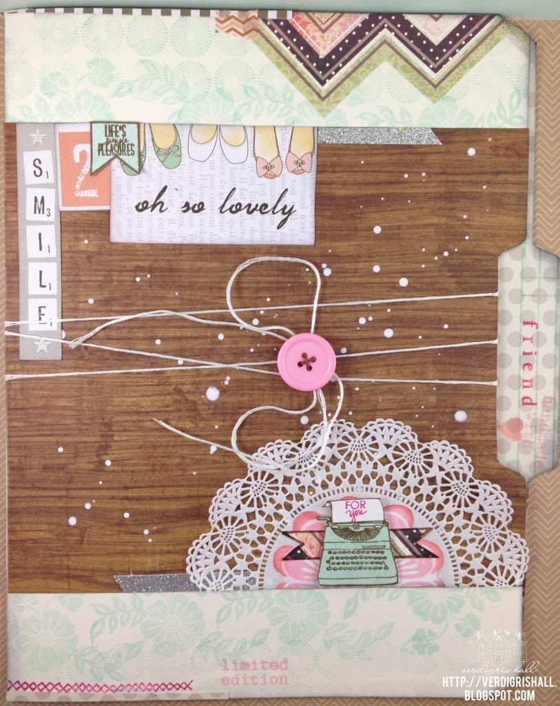
My mom was always big on sending birthday cards to family.  A few years ago I took over and began making handmade cards for my family (and friends although I was failed miserably last year...crash and burn style).

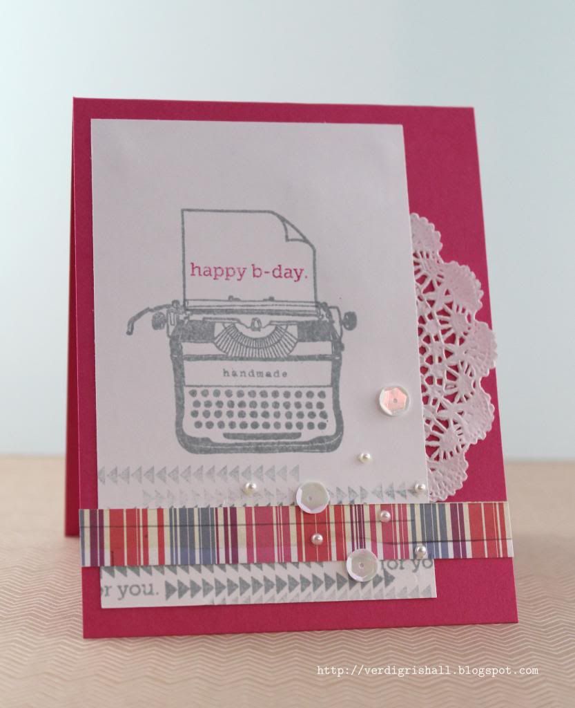
I am here today to share a masculine birthday card.  The first in a series I will be making this year.  Perhaps you remember the cards I made a couple of years ago which you can see again HERE (more than likely not)...I am using a similar philosophy this year as well.

I am a collector lover of digital products.  It is amazing the multitude of amazing designers out there.  It was actually a product by Designs by Lili (you may also know her as the designer of such marvels as Clementine Edition, Baby Editions, Jade Edition and Seasons Mini Kit of Project Life...she's good) that was the spark for this card's design (and those in the future).
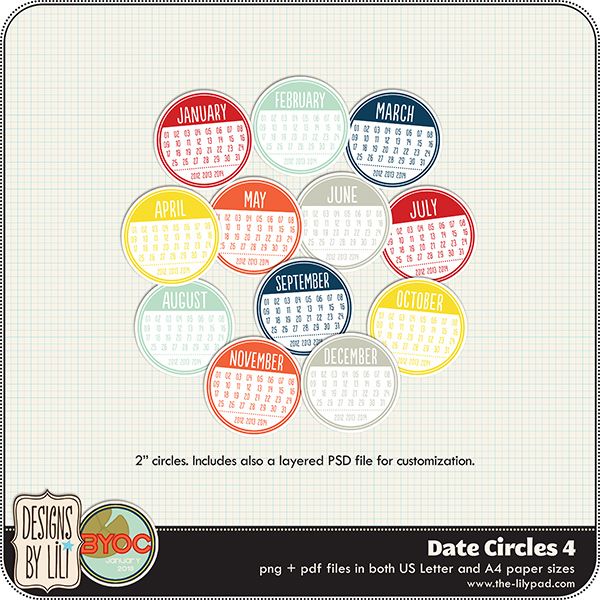
Meet Date Circles 4 (Hint, hint: they and everything at The Lilypad (one of my favorite digital shops) are on sale this weekend--January 18-January 21, 2013):


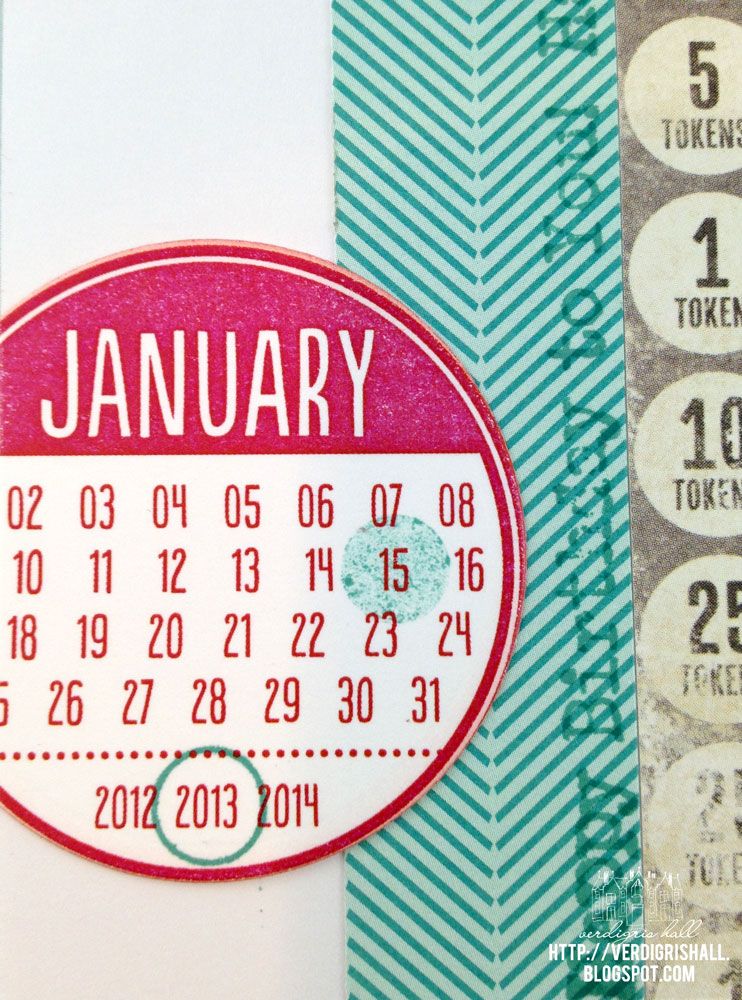
Pretty darn cool, huh?  I love the dates, circular design and colors of these Date Circles 4.


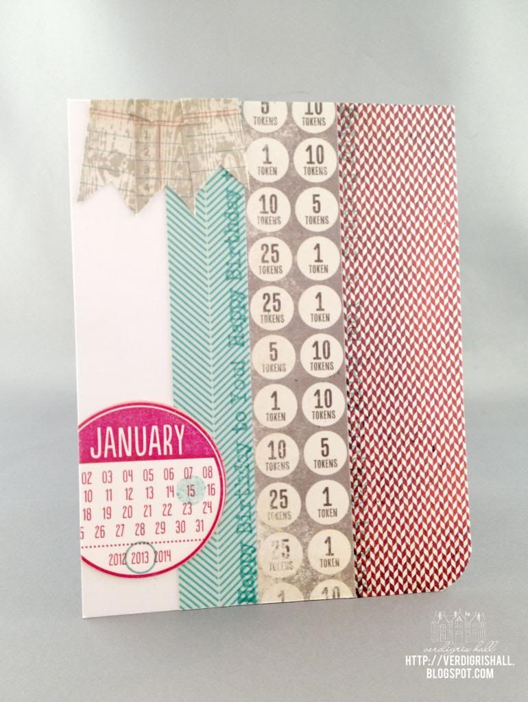
I placed the images of all the months I needed onto a Word document and printed them out on a single sheet of white cardstock.  Our new printer is a little off in color (it must need adjustment) as the orange came out red and the red a little more of a pink-red, but regardless they are still cool.

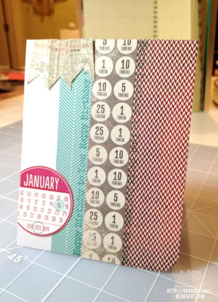
I began with a white cardbase (my favorite) to begin the card.  I already had Lawn Fawn's Dewey Decimal petite paper pad (6x6 paper) out from another card (boy, this is has become a go-to paper collection) and I thought the aqua/teal would be great with the red January circle.  I also picked out a piece of patterned paper with numbers and circles from My Mind's Eye Miss Caroline collection (Dilly Dally "Celebrate" Token) in a wonderful grey...red, grey, white and aqua/teal a winning combination.  The red herringbone piece of paper came from Basic Grey's Clippings collection 6x6 paper pad.  All of these papers are cut into strips of various widths for interest and adhered to the cardbase.

I wanted to use the "happy birthday to you" from Studio Calico/Hero Arts stamp set Calico Borders and I also wanted to bring in more of the teal color.  I found to my delight that Tim Holtz Distress Ink by Ranger in evergreen bough is a perfect match.  I stamped it once on the teal strip and also on the red strip (it is hard to see but there subtly).

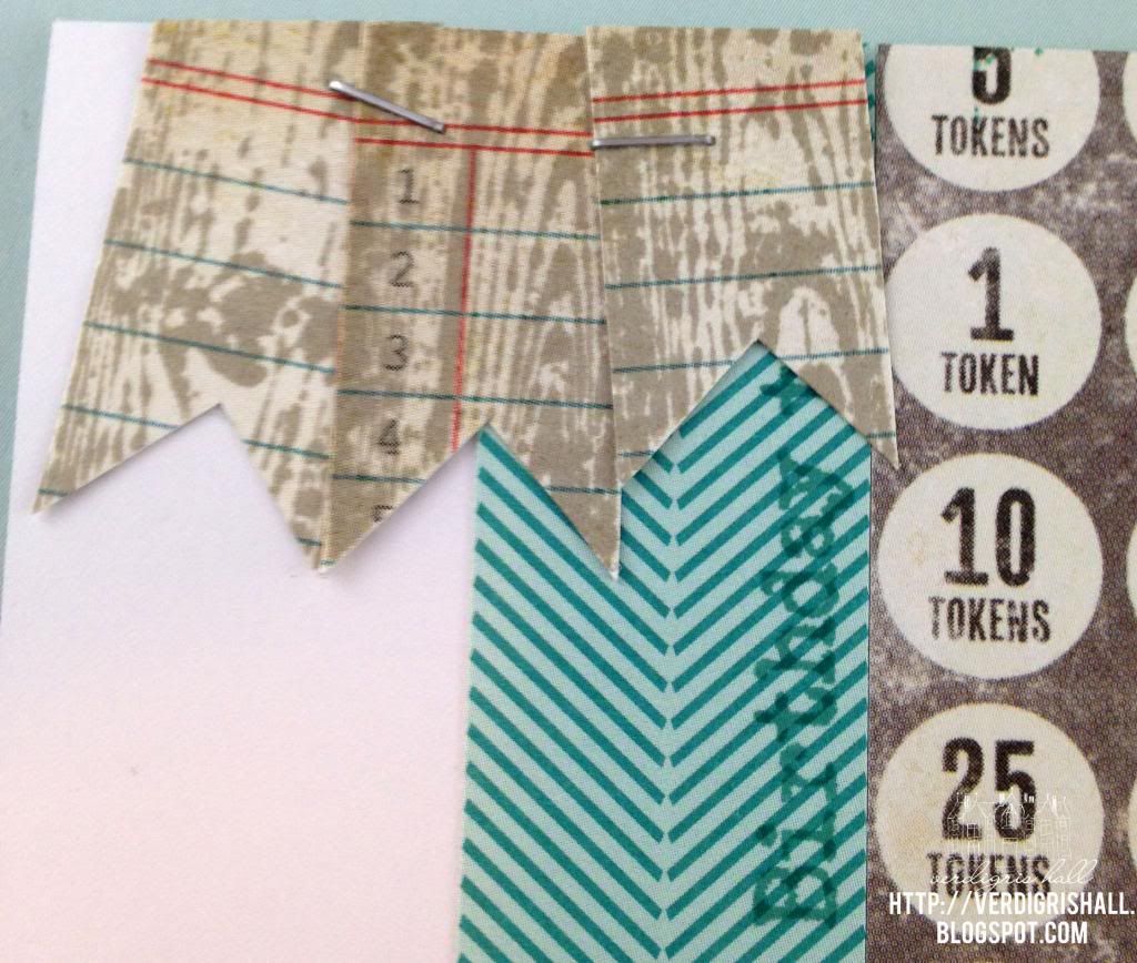
Using the reverse side of the My Mind's Eye Token paper (a cool ledger that coincidentally had the red and teal color too!), I stamped the woodgrain banners (woodgrain + banner = awesome) from the "Baby" stamp set from My Mind's Eye Miss Caroline Howdy Doody in wet cement Hero Arts Shadow Ink Mid-Tone, cut them out and adhered them together with my handy dandy Tim Holtz Tiny Attacher and then adhered them to the top left border of the card.


Lastly, I used the outline circle and solid circle from Cocoa Daisy's Day in the Life: Pick a Date Calendar stamp to highlight the day and year in the evergreen bough ink on red January calendar and then adhered it all to the card (making sure to cut off the overhang of the January circle) and I rounded the bottom right hand corner of the card.  By the way, check out Cocoa Daisy's stamps because they are pretty fantastic.


And there you have it, a personalized hybrid card for a guy (picture of the card in its natural habitat or place of origin aka my studio).


Thank you so much for taking the time to visit!

Have a brilliant weekend,

Shay.

Happy Birthday to You Birthday Card
Supplies:
Digital: Date Circles 4, Designs by Lili at The Lilypad
Stamps: Calico Borders, Studio Calico/Hero Arts; Baby from Miss Caroline collection, My Mind's Eye; A Day in the Life: Pick a Date Calendar stamp, Cocoa Daisy
Ink: evergreen bough, Tim Holtz Distress Ink by Ranger; wet cement, Hero Arts Shadow Ink Mid-Tone
Cardstock: solar white, Neenah Papers; white, Georgia Pacific
Patterned Paper: Dewey Decimal Petite Paper Pad, Lawn Fawn; Clippings 6x6 Paper Pad, Basic Grey; Token from Dilly Dally "Celebrate" Miss Caroline collection, My Mind's Eye
Other: Tiny Attacher, Tim Holtz; Crop-A-Dile Corner Chomper, We R Memory Keepers 

January 4, 2013

Paper Wings Productions January Blog Hop


Dear Reader,

Welcome dear Paper Wings Productions peeps!  It is a pleasure to have you join me here today for the first ever Paper Wings Production design team blog hop.  If you arrived from the fantastic Norma Gomez, you are in exactly the right place.  Haven't you been inspired by the fabulous new Paper Wings Production design team?

If you stumbled upon this post, I recommend heading over to the The Aviary for all the details on how to win some *blog candy*.  Make sure to leave some love along the way as you hop. 

The theme for this blog hop is friendship to celebrate the launch of new design team.  I decided to go with an idea that has been knocking around in my head for a while, has been popularized by Heidi Swapp (she calls hers memory files and they are pretty cool) and also uses up something that is now piling up at the office as we go digital: file folders.

I began with a plain white file folder, picked out the woodgrain patterned paper (a favorite of mine by Crate Paper), an older chevron paper from Basic Grey (from the Porcelain collection) along with a few papers from Dear Lizzy (mostly Neopolitan and a piece from 5th & Frolic) that I felt worked together.  From there I picked out an assortment of stamps to decorate my file folder and a few simple cards to stash in the folder as a little present for a friend (adding crafting supplies like stamps and/or a gift certificate/gift card would also be a lovely addition).

The cover is quite a mix of stamping, pieces of patterned paper plus a few other elements like silver glitter fabric tape, washi tape, half a doily, embroidery thread, white spray mist and a button.


The little typewriter came from the awesome Vintage Technology and really helped to convey the correspondence and vintage look for this project.  I stamped the "for you" from Sophie onto the little sheet of paper...so cute!  Under the typewriter are two other stamped images.  The two ended banner from Tabs and Banners which I stamped on the chevron paper and then the large half flower from Flower Power or Half Flower.


Directly on the file folder I stamped the flower from Flower Power and over stamped with the circle background from Backgrounds or Circles in the same ink color.  Over that I stamped "limited edition" from Limited Edition and the border from Details Framer.

 
The top of the file folder was also stamped with the flower from Flower Power and over stamped with the circle background from Backgrounds or Circles in the same ink color.  I created another little banner using Tabs and Banners on a piece of patterned paper and the sentiment is from Marcel.


I stamped the tab of the file folder first with Ledger Journaling Lines in aqua ink, stamped friend using Perfect Alphabet in fuschia ink and "handmade with" heart from the Handmade stamp set in pale pink ink.  I chose the outline heart and colored it in with a Copic marker.


For the inside of the file folder I had a lot of fun building a message to my friend using the Remember and Thankful stamp sets (I love these!), arrows from Evidence and I emphasized the sentiment with the second half of the doily and a sliver of the woodgrain paper and a little bit of silver glitter fabric tape.


On the right hand side of the inside of the file folder I added a pocket made from patterned paper.  Inside I placed the little cards made to coordinate with the file folder.  I ran washi tape up the inside seam of the file folder.  For a final touch I inked all the edges of the file folder.


A better view of the little cards.  Lately I have been really thrilled with the clean and fresh look of a white cardstock base with some pretty stamping and embellishments.  I love that when you choose a few pieces of paper for this project you can use little scraps to add a lot of interest to these little cards.  I used those little banners from Tabs and Banners nearly everywhere as they add the cutest punch of color and the little sentiments found in the Paperie Family sets fit nicely in them.  For mine on the cards I used Sophie.  To repeat the images used previously I used the circle background from Backgrounds or Circles, the flower from Flower Power and more images from Vintage Technology.  These cards could of course be dressed up more with jewels, brads, buttons, pearls, glitter, sequins, ribbon, twine, washi tape or any number of pretty items.  In fact adding a few items in the pocket would be a great way for your friend to customize the cards.


I hope this has inspired you to repurpose a file folder.  They are so much fun to decorate.  If you do create a project with a file folder, I would love to see it!

Now on to your next stop with Dana Tatar: http://datatar.blogspot.com/

If you lose your way on the blog hop, here is the list:

Amber Rasmussen - http://sew-ink.blogspot.com/
Shay - http://verdigrishall.blogspot.com/  <---You are here
Dana Tatar - http://datatar.blogspot.com/
And remember to return to The Aviary, become a follower and leave a comment.
 
Happy blog hopping,
Shay.
 
Supplies:
 

LinkWithin

Related Posts with Thumbnails