Showing posts with label Hero Arts. Show all posts

April 1, 2013

Man Oh Man Monday No. 4


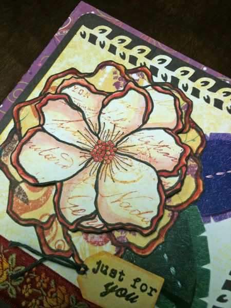
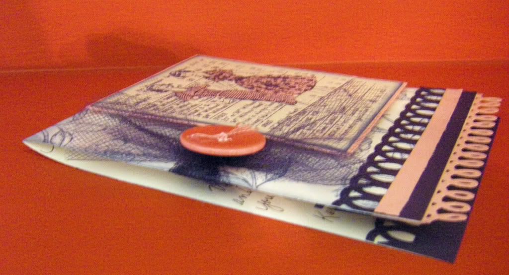
Hello, hello, hello!  For once I hope I disappoint you with the offerings in this post if you are here for the Ugliest Card Ever Blog Hop (you can find my post and uglies HERE).

It's another Man Oh Man Monday and a little later than I had intended.  I have to be honest that with a free weekend of HBO and Cinemax, I was weak and succumbed to watching a few movies this weekend.  It was all research for Man Oh Man Monday I swear!  I had to catch "Cowboys & Aliens" and "The Running Man" to better make a manly card.  I will have to ask my tax preparer if I could get a tax write off if I subscribed to HBO and Cinemax....


I still squeezed in making a couple of cards inspired by some crafting videos I saw this past week.  I would rate these Easy Going.  I saw a Hero Arts video on mosaics which really was the impetus for the cards this week.  I still had my Studio Calico card kit out on my work table so that is where the patterned paper came from.


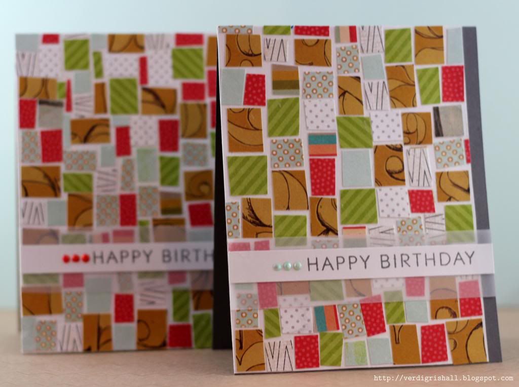
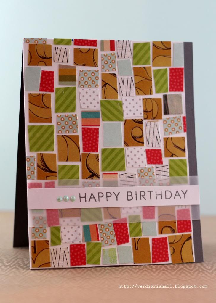
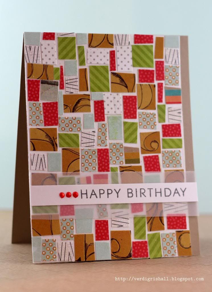
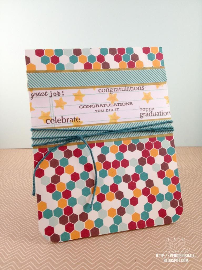
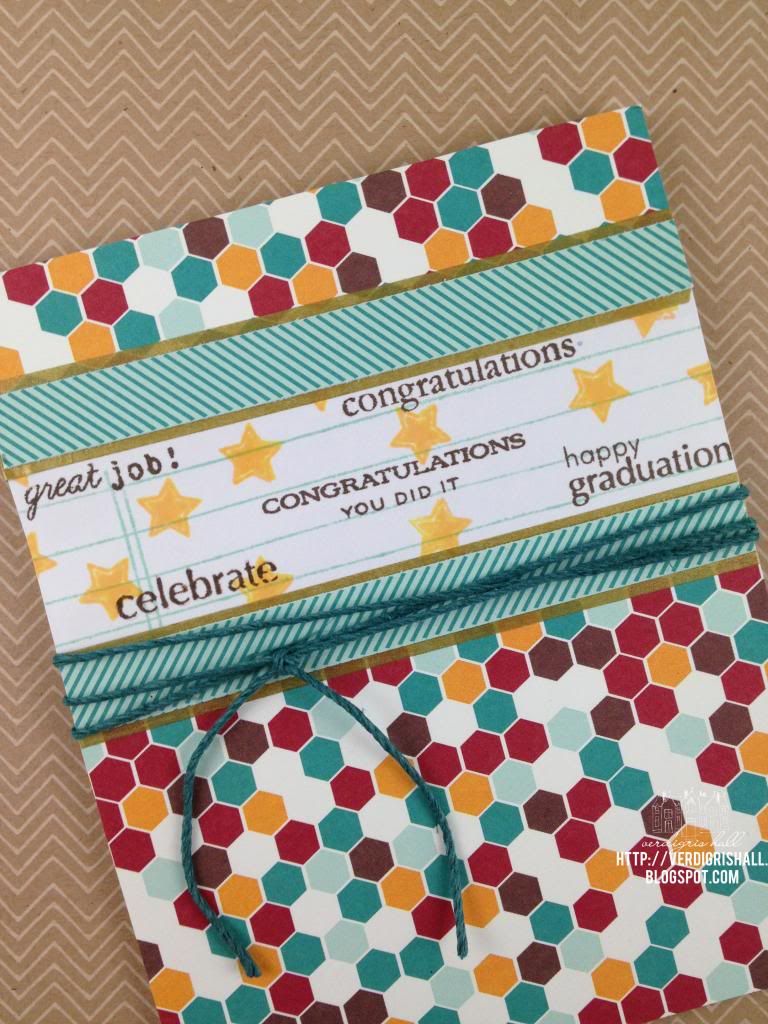
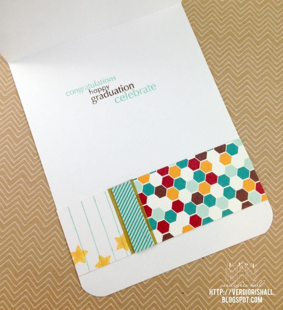
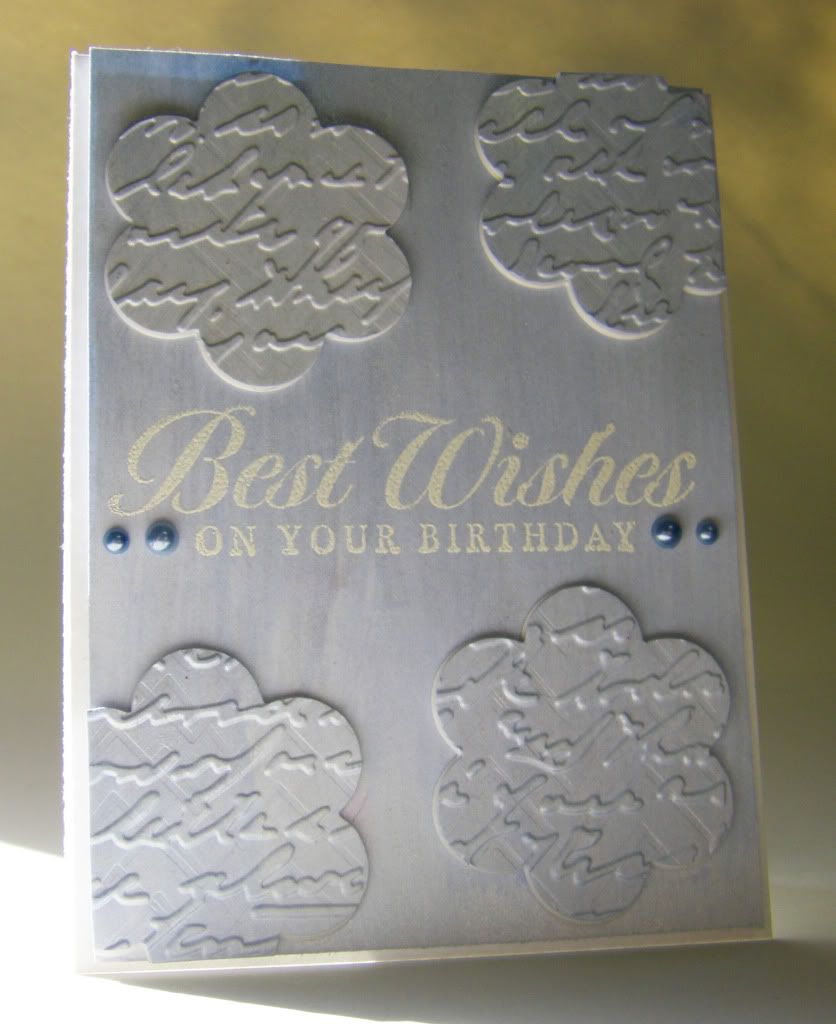
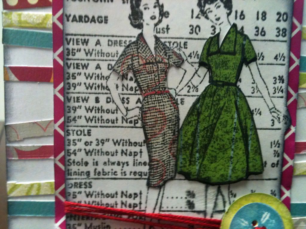
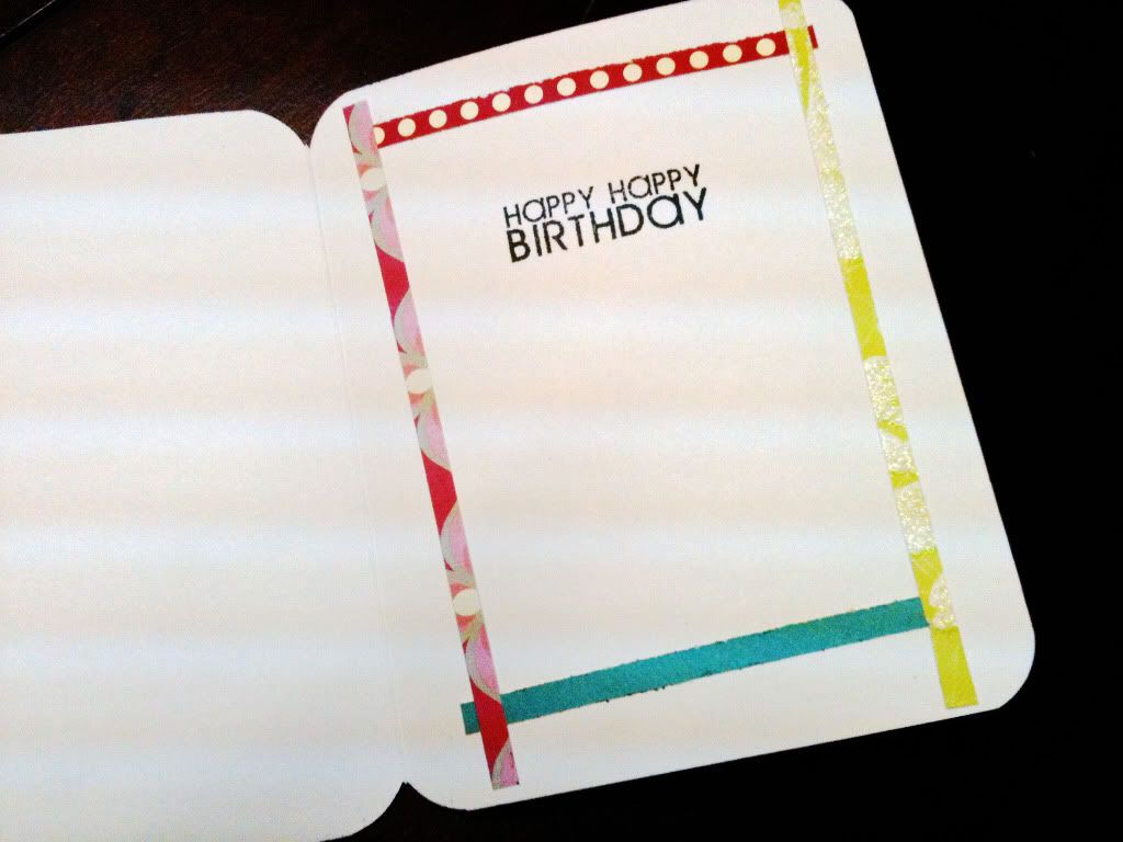
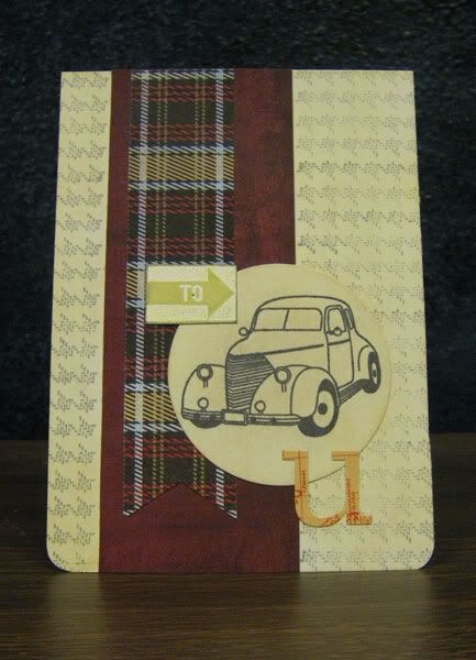
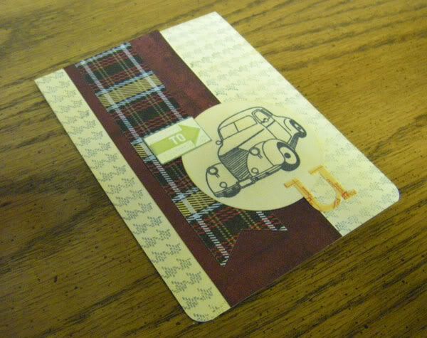
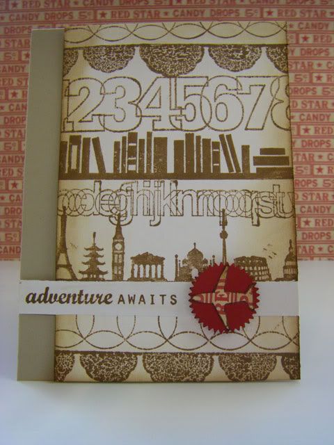
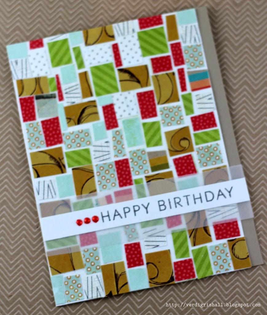
In a haphazard way, I cut strips and then rectangles of patterned paper.  Of course you can be as precise as you want, measuring everything.  I used Claudine Hellmuth's Studio Multi-Medium Matte to adhere the pieces of patterned paper in the exact same manner as Libby Hickson did using Modge Podge.  I adhered the mosaic panel to a card base.  The sentiment is stamped on a strip of white cardstock that I adhered to a strip of vellum.  I hid the adhesive on the vellum under the strip of white card stock.  The sentiment is stamped with charcoal grey ink.


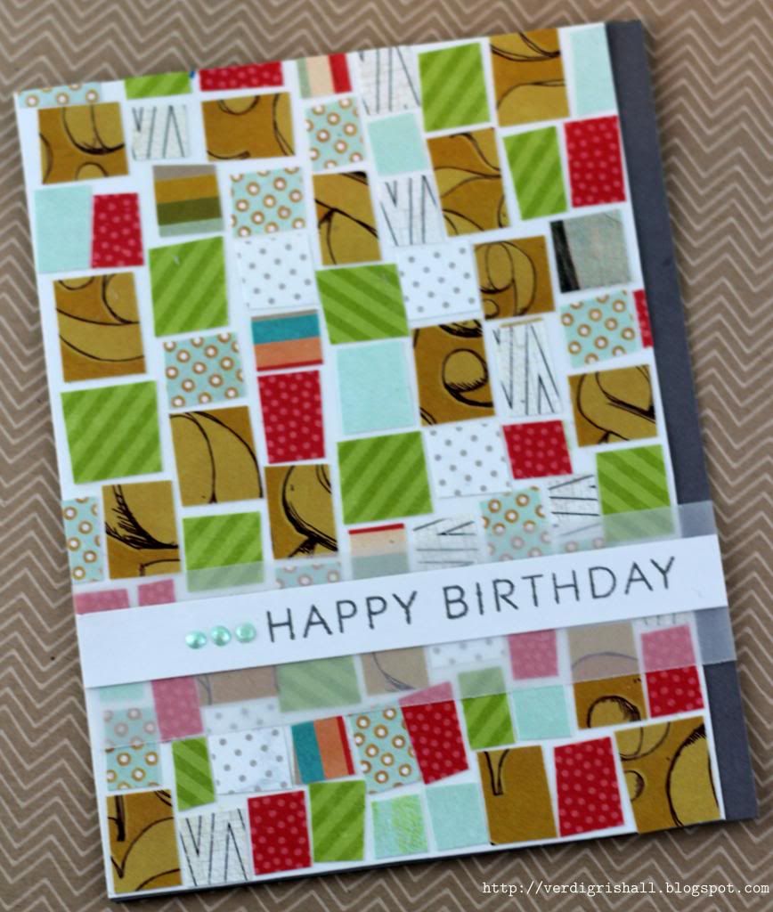
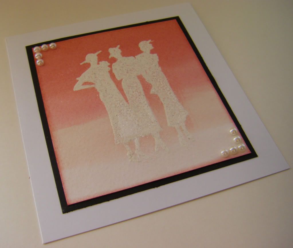
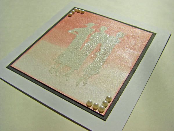
The pearls are actually little drops of Viva Pearl Pen that I squeezed onto my craft sheet and let dry, this was something I picked up from Jennifer McGuire in the Pattern Play class over at Online Card Classes. I recommend letting it dry for a few hours...maybe cook dinner and watch a movie or two in the meantime. I am just sayin'. After the little pearls were dry I used Copics to color them. Another tip is to not loosen the pearls from the craft sheet until after you color them otherwise they move around.


MOMM Tips:
MOMM Tip No. 1: Watch tv...or videos rather.  This isn't what your parents told you, but I urge you to check out YouTube, Vimeo and other sites with a plethora of hours of free crafting goodness.
MOMM Tip No. 2: Customize.  Use markers, paints or other coloring mediums to customize accents.

Well, that's it from me tonight.  Have an excellent night, day and/or week!

Happy creating,
Shay.

Supplies:

Stamp: Stylish Sentiments: Birthday, Papertrey Ink
Ink: charcoal mid-tone shadow ink, Hero Arts
Cardstock: white, Georgia Pacific; sand and pewter, Neenah Paper; vellum
Kit: Central High Card Kit, Studio Calico
Other: pearl pen in cream, Viva Decor; Claudine Hellmuth Studio Multi-Medium Matte, Claudine Hellmuth/Ranger; Mint Blue (B01) and Prawn (R24), Copic

January 22, 2013

Congratulations You Did It Graduation Card

Dear Reader,

I feel very blessed to have been named an honorable gnome for this past Lawnscaping Challenge (No. 49).  I was among a group of very talented stampers and you sure don't want to miss their entries.  Thank you to everyone who has commented on my card, it surely does brighten my day!

Now onto a bit of a companion card to the hybrid birthday card I shared with you Friday HERE.  I mentioned that I had Lawn Fawn's Dewey Decimal Petite Paper Pad out for a graduation card I made and this is that card.  The lad graduated from a college with the school colors of maroon and gold.  I found that one of the patterns in Dewey Decimal had a golden yellow and a maroon-like color in addition to aqua, teal, bright white and chocolate brown.  Perfect!  I also love the library/school theme to the Dewey Decimal which completely supports graduation and all the papers are from that paper pad.


I also pulled out several stamp sets from Papertrey Ink (mostly from the Tag-Its series which have great basic seasonal sentiments) to get some proper congratulatory sentiments.  I also tried out my Hero Arts Mid-Tone Shadow Ink in cup o'joe and butter bar...great coverage and color. Some finishing touches were gold washi to add a touch of the gold from the school colors (I added a strip of aqua and teal patterned paper over it because I didn't want *too* much gold) and a little teal lawn trimmings by Lawn Fawn which is a great accent for any gender.

Here is a more detailed shot of all the stamping and you can really appreciate the colors in that hexagon tile patterned paper (love!).


Inside the card in which I added a wide strip of some of my excess from the front of the card and stamping with the cup o'joe Hero Arts Shadow Ink along with aqua mist ink by Papertrey Ink:


That's a wrap on this card.  Thanks for stopping by to visit!

Happy creating,
Shay.

Congratulations You Did It Graduation Card
Supplies:
Stamps: Everyday Classics (retired limited edition); Tag-Its # 4; Tag-Its #6 and Fillable Frames #12, Papertrey Ink
Ink: cup o'joe and butter bar Mid-Tone Shadow Inks, Hero Arts; aqua mist, Papertrey Ink
Cardstock: white, Georgia Pacific
Patterned paper: Dewey Decimal Petite Paper Pad (6x6), Lawn Fawn
Other: Crop-A-Dile Corner Chomper, We R Memory Keepers; vivid triple pack cord lawn trimmings, Lawn Fawn; gold washi, Freckled Fawn (I think)

February 8, 2012

February's ATC Trade


Dear Reader,

Yesterday was another Artist Trading Card trade.   February's themes were dangle or undergarments (I know sort of a provocative grouping).  I chose to sign up for the undergarments theme...I thought I would go the corset route.  Monday when I seriously contemplated my design another idea came to me.  I carved out a few simple shapes: boxers, bra and panties (otherwise if I owned it I would have used swimsuit season by Lawn Fawn which would have been perfect!) for a cheery clothesline look. 


The background stamp is one of my all-time favorites by Hero Arts (S5215) as I love clouds (it must be a little of the 80's rubbing off on me).

Thanks for stopping by!

Happy creating,
Shay.

airing the dirty laundry ATCs
stamps: clouds (S5215), Hero Arts; remainder, handcarved
ink: tuxedo black, Memento Tsukineko; speckled egg, Jenni Bowlin for Ranger
marker: soft black, Memory Marker by American Crafts
cardstock: solar white (110 lb), Neenah Papers
patterned paper: love me 6x6 paper pad, My Mind's Eye
die: double-ended banners, Papertrey Ink
embossing folder: retro circles (from rays & retro circles 2-pack), Tim Holtz Alterations Texture Fades for Sizzix
other: baker's twine, Martha Stewarts Crafts; cuttlebug, Provo Craft; Crop-A-Dile Corner Chomper, We R Memory Keepers; staples and stapler, Tim Holtz Idea-ology Tiny Attacher by Advantus; gems; dimensional adhesive

January 19, 2012

Shimmer: Clean & Simple Card Making Class Days 3 & 5


Dear Reader,

It has been too long since I was creating in my studio (a week).  In fact there was a mess of stamps to clean from my last session before I could create in my square foot space among the clutter of supplies.  I have found that even though I am a mess, I can use my mess to my advantage at times.  I often will use what is about me--leftover paper, stamps, inks and even packaging at times. 

Having said that my studio isn't entirely a den of chaos.  There is order underlying the seeming disaster.  I have categorized and placed my products and tools in certain zones, but my tables always seem to be covered with stamps, papers and the like.  I like having my main tools at hand.  As my tables dominate the room, I have to keep apologizing for how it looks to family and friends.  My mom is especially critical of my studio as her sewing room is an example of organized crafting.  I do love the look of an extremely organized art space, I just don't create well within it. 

What about you?  Does order constrain or free you to create?  Do you like a balance of both?

Anyway, back to last night's creating.  I wanted to create some more cards for the Clean & Simple Card  Making class.  This time I made a card using Jennifer McGuire's lessons from Day 3 and Day 5. 


For Day 3 I chose to go with a simple die cut shape from Papertrey Ink called Friendly Flower.  I cut out numerous flowers from white cardstock to be used as layering under the top flower (I used four under each blue flower).  I had an idea of embossing the top dies to give them texture and further interest.  The blue paper I used was actually paper I had created using some shimmery blue acrylic paint several years ago and was just sitting in my stash waiting to be used.  I thought the shimmer along with brush strokes would add interest to this simple card.  The sentiment is a favorite of mine from Hero Arts' Friends are Treasures set.  I simply embossed that with white embossing powder and added a few pearls to set it off.

Another view with a pretty good representation of the color:


I think you can see some of the shimmer here and the dimension (you can also see the subtle zig zag impression under the script embossing):


For Day 5 I did a loose interpretation of Jennifer McGuire's watercolor blocking technique as I was inspired by heart ornaments we have hanging off our chandelier that we bought from Victorian Trading Company.  They have an ombred background with white glittered silhouettes over it. 

Here is the inspiration (picture from Victorian Trading Company):


The card:


I stamped the silhouette (Silhouette Women by Hero Arts) with Versamark ink onto watercolor paper.  I thought I would try using a sparkly embossing powder with a touch of white to get a glitter effect, but I am not thrilled with the coverage.  I later added some glitter over the women. In the future I would probably just emboss in white and add the glitter by using a glue pad over the embossed image.  After embossing, I painted bands of color from lightest to darkest (spun sugar, tattered rose, worn lipstick and fired brick) using Tim Holtz Distress Ink.  I smudged the ink directly onto my craft sheet, sprayed a little water and then one spritz of Studio Calico Mister Huey's Calico Shine onto the ink and painted it on.  I edged the watercolor paper panel and matted it on a little black and added the pearl corners.

This picture is closer to the colors on the actual card, but still a bit off:


Showing some of the shimmer and glitter:


Thank you for stopping by!

Happy creating,
Shay.


{best wishes birthday card}
stamp: Friends are Treasures (CG277), Hero Arts
ink: Versamark, Tsukineko
embossing powder: opaque white, Judi Kins
cardstock: white, Georgia Pacific
die: friendly flower, Papertrey Ink
embossing folders/plates: script, cuttlebug by Provo Craft; Halloween letterpress printing plate, Lifestyle Crafts
other: denim pearls, Kaisercraft; acrylic paint; cuttlebug, Provo Craft

{ombre women card}
stamp: silhouette women (CG278), Hero Arts
ink: fired brick, worn lipstick, tattered rose and spun sugar, Tim Holtz Distress Ink by Ranger; Versamark, Tsukineko
embossing powder: polysparkle, Ranger; opaque white, Judi Kins
watercolor paper: cold press, Strathmore
cardstock: white, Georgia Pacific; black from stash
spray: calico shine, Mister Huey's Color Mist by Studio Calico
other: crystal fine glitter, Martha Stewart Crafts; pearls, The Paper Studio

January 18, 2012

Bohemian Flower


Dear Reader,

For a college friend of mine I wanted to make a card with a gypsy or bohemian feel for her birthday.  I was also taken with coloring and playing around with Hero Arts' Stencil Flower (CG194).  I love this stamp and I keep on buying flowers similar to it so I can do paper piecing + coloring with them like I did for this card.  


I usually cut up the flower into two parts for added interest and dimension. The top part of the flower I chose a more muted part of the paper and then I stamped over this section with the Old Letter (CG197) stamp using a mix of inks for variegated coloration.  I edged the entire flower with marker to make it really pop and colored in parts with my Copic markers.  The top layer of the card is then attached to the bottom using dimensional adhesive.  The leaves are actually digital images of felt feathers from Kitschy Digitals (all of her designs can be found at http://www.jessicasprague.com/) that I printed out and cut out.

Thanks for stopping by.

Happy creating,
Shay.


{bohemian birthday card}
stamps: stencil flower (CG194), old letter (CG197), Hero Arts; fillable frames #9, Papertrey Ink
ink: tuxedo black, Momento by Tsukineko; lemon drops, chicken feed and chili powder, Jenni Bowlin for Ranger
patterned paper: purple from Green at Heart, Basic Grey; yellow paper, Glitz Design (I believe)
markers: Copic; soft black, Memory Markers by American Crafts
die: tiny tags, Papertrey Ink
punch: Martha Stewart
leaves: pretty felt feathers, Kitschy Digitals
other: ribbon from stash; embroidery floss, DMC; dimensional foam tape; crop-a-dile corner chomper, We R Memory Keepers; cuttlebug, Provo Craft

January 12, 2012

Ladies with Sass


Dear Reader,

I have a card to share with you today.  It is a snappy little number with a matching envelope. I made this birthday card for my college aged cousin so I wanted something fun, a bit funky, but with a fashion theme.  I went with the Make Your Own stamp by Hero Arts and used up a lot of strips of scraps I had on hand of bright and fresh patterned paper to create a background and also to paper piece the ladies' dresses.  The button image is a stamp from Button Boutique by Papertrey Ink.


Norma Desmond time (every time I think close up I see that scene: "All right, Mr. DeMille, I'm ready for my close-up."):


Inside:


Last year, when time permitted I would try to create matching envelopes for my cards as I love that something extra a decorated envelope gives. 

Do you have a stack of paper (as in a giant pad of patterned paper) that you bought several years ago and at a loss as to what to do with it as the paper is pretty light weight and the designs are so last decade?  I have several pads of paper that I wanted to figure out how to use (if I were sane I would have passed these papers on to a new home some time ago, but in my delusions I believe I can turn lemons into lemonade) and this is what I do: make the papers into custom envelopes using templates my mom bought me from QVC many years ago.  I place the pattern inside the envelope and decorate the white outside as I like (usually with Label Basics and Postmarks stamp sets by Papertrey Ink).

Matching Envelope:


Inside envelope:


Thanks for stopping by!

Happy creating,
Shay.


{ladies with sass birthday card}

stamps: make your own (CG175), Hero Arts; button boutique and fillable frames #1 (inside card), Papertrey Ink
ink: fountain pen, Jenni Bowlin for Ranger; broken china and black soot, Tim Holtz Distress Ink by Ranger
cardstock: white, Georgia Pacific
patterned paper: all scraps from an old Scarlet Lime kit
die: buttoned up #1, Papertrey Ink
other: scallop black border, Carolee's Creations Adornit; crop-a-dile corner chomper, We R Memory Keepers; embroidery floss, DMC; cuttlebug, Provo Craft

{matching envelope}
stamps: label basics and postmarks, Papertrey Ink; simply handmade (CL429), Hero Arts
ink: chili powder and fountain pen, Jenni Bowlin for Ranger; broken china and black soot, Tim Holtz Distress Ink by Ranger
patterned paper: DCWV
envelope template: Kreate-a-lope by Green Sneakers Incorporated

January 11, 2012

Clean & Simple Card Making: Lessons 1 & 2

Dear Reader,

I am currently enrolled in the Clean & Simple Card Making class at Online Card Classes.  Last night when I should have been going to sleep (in fact I put the dogs to bed and they happily slept without me), I went into the studio to catch up on the videos for the class and try my hand at the lessons.  I was really inspired by Julie Ebersole's (I really loved her video and I hope she does more videos in which she talks as she has such great energy and an infectious laugh) one layer cards so I tried my hand at that first.


This card should have been a breeze and once I figured out exactly what I wanted to do, it was.  With full disclosure, I ended up making it 3 times.  The first time I used too heavy of a hand with the background and hearts.  The second time it turned out well with a simpler background and only one heart, but I didn't like the size of the card.  The last time was the charm.

I wanted to create a Valentine's card with the cute plane from Bon Voyage by Lawn Fawn and have a banner sign being pulled by it with a customized sentiment.  I love all of the abcs by Lawn Fawn as they are designed to make it easy to stamp any word or sentiment you desire.  I wanted to stamp "sending" so I used my Smitty's ABCs and paired that with the sweet "love" from Sophie's Sentiments (suggestion: if you are new to Lawn Fawn start with Sophie's Sentiments along with whatever other stamp sets catch your fancy) and then added a little heart from Cruising Through Life in red for a little interest and drama (in the future I may fill in the heart with stickles or just a marker or emboss it, but I wanted this card to be a simple stamp and ink card).  The banner is a two sided ribbon banner from Bannerific, but I wanted one side to be plain so I simply removed the ink from one edge of the inked up stamp and once stamped filled in the area with a marker as I wanted it and added the attachment to the plane.  I stamped the banner and plane first, then masked them off before stamping the cloud background.  Lastly, I rounded the bottom right corner.


The second card I made uses one of the simple sketches by Kristina Werner.  I needed a masculine birthday card so I grabbed my Oxford 6x6 patterned paper pad by Basic Grey.  Stuck in there was a strip of the claret colored paper I had left over from a previous card so that was my jumping off point.  I began with a white card and stamped the Dash Pattern background stamp by Basic Grey/Hero Arts, but after adding the plaid strip of paper over the claret the white wasn't right so I colored all the white cardstock using my Antique Linen Distress Ink.  As my card is for a relative that has an interest in cars I used the vintage car from the Going stamp set by Hero Arts on a circle cut using a Spellbinders' die and also decided to also use the "to arrow" image in the set for further interest and to begin a sentiment.  I embossed the "to arrow" stamp and filled in the unembossed section with Shabby Shutters Distress Ink with white embossing powder, but since I changed the color scheme away from bright white I colored over the white embossed image with some Copic markers.  Usually I would have used some dimensional adhesive on a card, but I wanted to go away from my usual modus operandi (can you tell I have been reading some mystery novels?) on this card.  I added a "u" sticker from Studio Calico and rounded the bottom corners of the card.

Thanks for stopping by! 

Happy creating,
Shay.


{sending love card}
stamps: (sending)smitty's abcs, (plane&cloud)bon voyage, (heart)cruising through life, (love)sophie's sentiments; banner(bannerific), Lawn Fawn
ink: tuxedo black, Memento; soap powder & cough syrup, Jenni Bowlin for Ranger
cardstock: white, Georgia Pacific
marker: soft black memory marker, American Crafts
other: crop-a-dile corner chomper, We R Memory Keepers

{to u card}
stamps: (to arrow&car)going, Hero Arts; dash pattern, Basic Grey/Hero Arts
ink: tuxedo black, Memento; shabby shutter, antique linen & black soot, Tim Holtz Distress Ink by Ranger; weather vane, Jenni Bowlin for Ranger; versamark, Tsukineko
embossing powder: opaque white, Judi Kins
cardstock: white, Georgia Pacific
patterned paper: oxford 6x6 paper pad, Basic Grey
markers: Copic
die: from nesties classic & standard circles nestabilities set, Spellbinders
stickers: u from documentary collection alphabet stickers, Studio Calico
other: crop-a-dile corner chomper, We R Memory Keepers; cuttlebug, Provo Craft

July 14, 2011

Last Minute


Dear Reader,

You thought you were done with me today.  After all, I posted a card today, but just in the last half hour or so I made another card for this week's color challenge. 

I have a slew of border stamps from Studio Calico which I adore (I have a slew of Studio Calico stamps period).  Actually to say I adore them is too pallid of a statement.  They are simply glorious because they are simple, clean, graphic and usually work for any number of applications.  I decided to make a background using them along with one border stamp that I also adore from Hero Arts: international skyline.    Additionally, I happen to be a nut for travel themes.  I can't get enough of them for whatever reason and it is nearly compulsive.  It's something similar to when there is a song that I really like and I listen to it over and over again.  When I love something it sticks with me. 

Back to the point, I thought all of these disparate images could come together under the sentiment from Papertrey Ink, "adventure awaits".  I love this sentiment because it is so full of promise and I recently used it on graduation cards I made because of this.  Add a airplane punch and I am happy.

Now to the card:


By the way, did you hear the sensational news that Hero Arts is now working with Studio Calico to produce stamps? Check out either Hero Arts' blog or Studio Calico's blog for more information, sneak peaks and a blog hop with chances to win said stamps and also paper from upcoming releases from Studio Calico. 

Thank you for visiting the Hall again!

I hope adventure awaits you,
Shay.

Adventure Awaits Card
Supplies:
Stamps: all border stamps except international skyline and overlapping circles (which is Studio Calico + Hero Arts), Studio Calico; international skyline (H5470), Hero Arts; adventure awaits from Road Trip set, Papertrey Ink
Ink: vintage photo, Tim Holtz Distress Ink by Ranger
Cardstock: sand, Neenah Papers; white, Georgia-Pacific; red from stash
Patterned Paper: Jenni Bowlin
Punches: airplane, EK Success; circle, Martha Stewart Crafts
Pen: memory markers in chestnut, American Crafts
Other: dimensional adhesive by American Crafts and Scotch

On the Town


Dear Reader,

I return with a card for Week 3 of the Summer Card Camp 2011 online class.  This one is completely out of character meaning it is clean and simple.  I admire cardmakers like Maile Belles who pull these cards off over and over with panache.  I am not one of them, but a girl can try can't she? 

I had a concept in mind using some lovely Hero Arts stamps I had bought, but sadly not used yet.  I broke them out and liberated them.  Hopefully they will enjoy much more inky happiness in their future.  I thought the lovely ladies from Three Silhouettes along with the Cityscape were perfect for a Girls' Night Out card.  I am not a girls' night out type of person...I am a true homebody, but I like the idea of ladies that party until they drop in killer dresses and more lethal heels.   I am happy the option is out there and some partake. 

Here's the card:


Thank you so much for visiting the Hall!

Hoping some of you have lethal heels,
Shay.

Girls' Night Out Card
Supplies:
Stamps: Three Silhouettes (LP195) and Cityscape (K5325), Hero Arts
Ink: malted milk and brown sugar, Jenni Bowlin for Ranger
Cardstock: earthstone, Neenah Papers; white, Georgia-Pacific
Pen: memory marker in chestnut, American Crafts
Other: red emboidery floss, DMC and Crop A Dile Corner Chomper, We R Memory Keepers

July 8, 2011

Ticket to Fly

Dear Reader,

Do you love the little art known as Artist Trading Cards (ATC) as much as I do?  I have been participating in a monthly local trade for nearly 8 years now.  Each month we have two themes to choose from (or for the ambitious they can do both themes).  In January the theme I chose to sign up for was Make-Your-Own-Background.  I *love* making backgrounds.  I find it very therapeutic and calming as the mind wanders and the fingers do their magic.  I had no real idea of what I was doing for my background although I thought I could use a copy of two masterboards I made using some Hero Arts stamps, crayons and Adirondack Color Washes a while back. 

Here are the masterboards (it is a fun crayon resist):


That was when things got a bit crazy. 

I sprayed some of my Studio Calico Mister Huey's on the copy to mute the vibrant greens, oranges and yellows a bit (and to just play with them because they are fun!).  I added a strip of orange electrical tape bought at Home Depot last fall (with Halloween in mind).  Then I thought why not pull out one of my old Scarlet Lime kits and play with some of the cool elements I had in it?  So then I placed some alphabet stickers from Prima randomly all over each of the backgrounds.  Then I added a glittery lacy sticker border in the middle over the electrical tape.  Add some Glimmer Misted and stamped tickets (love, love my House of 3/Pink Paislee Parisian Anthology stamp set.  My recommendation: if you find this stamp set, snap it up!) attached with Tim Holtz's Tiny Attacher, misted bird punch mixed in with patterned paper punched pieces, a bling eye from Prima and there's the card.


Thanks for stopping by the Hall!

Happy creating,
Shay.

Alphabet Soup ATCs
Supplies:
Stamps: tree, bird & flourish in masterboards from Tree, Birds & Messages set (CL182), Hero Arts and damask and postal cancellation from Parisian Anthology set, House of Three/Pink Paislee;
Ink: chipped sapphire, Tim Holtz's Distress Inks by Ranger
Cardstock: white, Georgia-Pacific; golden orange scraps
Patterned Paper: GCD Studios
Punch: bird & twig, Stampin' Up!
Sprays: Mister Huey's Calico White, Studio Calico; denium blue glimmer mist, Tattered Angels; lettuce, Tim Holtz's Adriondack Color Wash by Ranger
Other: yellow alphabet stickers, Prima; green glitter paper lace; orange electrical tape; tiny attacher, Tim Holtz; clear jewel, Prima; tickets; crayons, Crayola; Crop A Dile Corner Chomper, We R Memory Keepers 

February 17, 2011

Flashback: Mother's Day

Dear Reader,

I hope this past Valentine's Day brought you a lot of time spent with your loved ones and perhaps some chocolate or other sweet goodies.  I enjoyed dark chocolate covered strawberries...some with real gold dust.  I really should have taken a picture of them because they were beauties...rather I relished the taste of them and forgot about all else.

Today we are going to do a little step back in time as this post is about the card I made my mom for Mother's Day last year.  One thing I have realized is I need to get a stamp set which has sentiments regarding Mother's Day.  Being someone who doesn't use sentiments as much as others I have a lot of voids in my stamp collection where sentiments should be (we all have to have priorities if we are ever to wade through all the products we want).

Back to the card...my mom loves blue.  Anyone who knows her knows this or should because it is a very defining part of who she is.  I can't describe the depth of her love for blue.  I know there are green families out there in which everyone has a deep and abiding love for green, but most of my family are advocates of blue to the point that my dad is thrilled that the night lighting of the electronics in his new car is blue (and the car is blue to ease your mind).  This feeling my dad has for blue (and neither really like green) helps cement my belief that my parents were destined to be together.  After blue, pink is my mom's favorite color...in fact her sewing room is pink with accents in black and white.  With this in mind I kept with a blue, pink and white color scheme.  As I mentioned she has a sewing room and therefore whenever I see sewing related images I know they are going to be perfect for my mom.  When I saw these Hero Arts stamps I knew they were just right for my mom.


This is a fussy (busy) card, but my mom can be even more fussy than I am so it really suits her.  I chose to highlight the dresses (and introduce the pink onto the main image) by stamping them onto pink cardstock and adding them to the neutral main image.  Since I couldn't find a ribbon I wanted to use with the card I went with navy tulle that my friend very generously bought me a while back and I am happy with the result.  I hope you enjoy looking at the card.

Card Pose No. 2


Thanks for calling at the Hall!

Mother's Day Card
Supplies:
Stamps: Make Your Own (CG175) and Roses from Two Birds (CG152), Hero Arts
Inks: Chipped Sapphire, Stormy Sky and Spun Sugar (inside), Tim Holtz Distress Inks by Ranger Industries
Cardstock: Night of Navy, Stampin' Up!, White, Georgia Pacific; Earthstone, Neenah Papers; Pink, scrap pile
Button: From Spring Mix, Paperrtrey Ink
Punches: Martha Stewart
Other: Navy Tulle; Pink Emboidery Floss, DMC

February 3, 2011

Time Warp: May Hero Arts Club

February 3, 2011 note: I found this post sitting within my draft posts.  It merely needed a picture added to be complete.  So I am posting it now.

From summer 2010:

I have been sucked into some sort of strange time warp.  Before I knew it several weeks had passed since I posted on this blog.  Whilst away I did make a couple offerings for May's Hero Arts Club challenge.  We were supposed to use the upper left hand image of this set to make something (one lady made wonderful labels using the frame for the delicious food she and her friend provided for the meeting..I wish I had thought to take a picture of it because the table was lovely!):


I decided to go with cards (huge surprise).  I began with my March 2009 Scarlet Lime kit for color inspiration and the idea of using the shape of the frame as a mask much like I did with the Daisy from April's Hero Arts Club Challenge.  This time I used some of my Glimmer Mist instead of ink to color the card base.  I also wanted to use the Friends cling set to fit into those masked frames (and they fit nearly perfectly).  At first I thought my colors would primarily be green and blue with a punch of orange and I colored in the frame with orange accordingly, but after my sister's rather unfavorable reaction to the colors I decided the orange frame must be the beginning of another card entirely.  This often happens to me as if even my creativity gets distracted and must work on more than one thing.  So I remained with green, blue and touches of a sandy grey (for the mask card and did another card with black and white and punches of orange and green that I decided would work for my aunt's graduation from medical school.

One last note, I realized I may be the world's worst bow maker (if possible it is worse than my photography).  I think I spent almost the same amount of time tieing the bow on the card as all the rest of the card...may be the reason I don't use ribbon as much as many other people.  This is probably explained by the fact that the only way I was able to learn to tie a bow when I was little was the the double loop system and it is only in the last couple of years that I have been able to tie a bow in the more common way.  I also learned how to jump rope by flipping the rope behind me then jumping rather than in front of me as it was the only way that I could physically do it at the time.  Go figure.

Here are the results:


Thanks for calling at the Hall!


Happy Birthday Card
Supplies:
Stamps: Three Floral Frames (CL384), Friends (CG106), Starburst (F5318) and Happy Birthday, Hero Arts
Inks: Pumice Stone, Shabby Shutters and Tumbled Glass (I think, but it could be Broken China), Tim Holtz Distress Inks by Ranger Industries
Mist/Spray: Green Meadows, Tattered Angels Glimmer Mist
Cardstock: Sand, Neenah Papers
Patterned Paper: Beach Caribe and Cantando (from Canta Collection), GCD Studios
Other: Crop-A-Dile Corner Chomper, We R Memory Keepers; Ribbon, Offray; Colored Pencils

For You Card
Supplies:
Stamps: Three Floral Frames (CL384), For You from Dolls (CL289), Hero Arts
Inks: Shabby Shutters and Peeled Paint, Tim Holtz Distress Inks by Ranger Industries
Patterned Paper: Beach Caribe and Cantando (from Canta Collection), GCD Studios
Other: Colored Pencils

May 7, 2010

Mother's Day

Mother's Day is just around the corner and I luckily still have both of my grandmothers to make cards for.  During the Hero Arts Club meeting in March we played around with alcohol inks (fun!).  I happened to make a card in which I covered both front and back with alcohol ink and stamped on with flowers.  Because the colors ended up being purplish and the stamps were flowers I knew I could cut up the card into two panels for my grandmothers (one of them loves purple and the other loves flowers).  I would usually make two different takes on the cards, but after it took me an hour to find this card (I have reorganized which basically means I have to figure out the new places I put things) I decided it would make more sense to make the same card (there are very slight variations like size).  I chose a very simple layout and application (I am shocked at myself!) and let the alcohol ink panel really be the star. 


I wish all the mothers, grandmothers and caregivers out there a very wonderful Mother's Day.  May your day be filled with love and care.

Thanks for calling at the Hall!

Flower Power Mother's Day Cards
Supplies
Stamps: Silhouette Burst (H5312), Flower Blossoms (F4489) and Flower (not sure what stamp this is even after an extensive web search), Hero Arts
Inks: Jet Black, Archival Ink by Ranger Industries
Alcohol Inks: Cranberry, Pool, Stream and Gold (if I remember correctly), Tim Holtz Adirondack by Ranger Industries
Cardstock: Purely Pomegranate, Stampin' Up!; Lavender Moon, Papertrey Ink; Gold Metallic
Border Punch: Dot Scallop, Martha Stewart Crafts
Other: Black Ribbon, Ofray; This-to-That Dimensional Foam Adhesive, American Crafts (my new favorite for chunky dimension!)

LinkWithin

Related Posts with Thumbnails