Showing posts with label clean and simple card making. Show all posts

April 8, 2013

Man Oh Man Monday No. 5

Happy Monday!

I am bringing you a very simple card today.  Men like simple, right?  Or at least some men do.  The card focuses almost entirely on a stamp I fell in love with by Paper Smooches called appropriately Dapper.  It is an amazing two-toned background that is perfect for guys as well as gals.  The design is fabulous and makes you look like a stamping pro (that of course you already know you are).

I would qualify this card as Easy Going.


I went with a fresh green and white color scheme (this would obviously be great for St. Patrick's Day too!).  I simply stamped Dapper once on a piece of white cardstock and then stamped the distinctive handwritten sentiment also by Paper Smooches sideways to the right.  I was going to leave it at that, but I decided to go with an added dash of flash in the way of matching glitter tape...dapper indeed!  I then adhered the white card panel to a green card base with dimensional adhesive and called it done.  Clean, simple and debonair which can be attributed to a fantastically designed stamp.  Thanks, Paper Smooches!  I don't think we've seen the last of Dapper.


MOMM Tips:
MOMM Tip No. 1: Use a well designed background stamp as the focus of your card.  With that one design you don't need much to dress it up.
MOMM Tip No. 2: Monochromatic can be magnificent.  Choose one color and go for it!

Have you used Dapper before?  What did you think?  Is there a background stamp that you have a design-crush on? 

Happy creating,
Shay.

Supplies:
Stamps: Dapper and Sentiment SamplerPaper Smooches
Ink: seed packet, Jenni Bowlin for Ranger
Cardstock: white, Georgia Pacific; new leaf, Papertrey Ink
Other: evergreen glitter tape, American Crafts; dimensional adhesive, American Crafts

January 19, 2012

Shimmer: Clean & Simple Card Making Class Days 3 & 5


Dear Reader,

It has been too long since I was creating in my studio (a week).  In fact there was a mess of stamps to clean from my last session before I could create in my square foot space among the clutter of supplies.  I have found that even though I am a mess, I can use my mess to my advantage at times.  I often will use what is about me--leftover paper, stamps, inks and even packaging at times. 

Having said that my studio isn't entirely a den of chaos.  There is order underlying the seeming disaster.  I have categorized and placed my products and tools in certain zones, but my tables always seem to be covered with stamps, papers and the like.  I like having my main tools at hand.  As my tables dominate the room, I have to keep apologizing for how it looks to family and friends.  My mom is especially critical of my studio as her sewing room is an example of organized crafting.  I do love the look of an extremely organized art space, I just don't create well within it. 

What about you?  Does order constrain or free you to create?  Do you like a balance of both?

Anyway, back to last night's creating.  I wanted to create some more cards for the Clean & Simple Card  Making class.  This time I made a card using Jennifer McGuire's lessons from Day 3 and Day 5. 


For Day 3 I chose to go with a simple die cut shape from Papertrey Ink called Friendly Flower.  I cut out numerous flowers from white cardstock to be used as layering under the top flower (I used four under each blue flower).  I had an idea of embossing the top dies to give them texture and further interest.  The blue paper I used was actually paper I had created using some shimmery blue acrylic paint several years ago and was just sitting in my stash waiting to be used.  I thought the shimmer along with brush strokes would add interest to this simple card.  The sentiment is a favorite of mine from Hero Arts' Friends are Treasures set.  I simply embossed that with white embossing powder and added a few pearls to set it off.

Another view with a pretty good representation of the color:


I think you can see some of the shimmer here and the dimension (you can also see the subtle zig zag impression under the script embossing):


For Day 5 I did a loose interpretation of Jennifer McGuire's watercolor blocking technique as I was inspired by heart ornaments we have hanging off our chandelier that we bought from Victorian Trading Company.  They have an ombred background with white glittered silhouettes over it. 

Here is the inspiration (picture from Victorian Trading Company):


The card:


I stamped the silhouette (Silhouette Women by Hero Arts) with Versamark ink onto watercolor paper.  I thought I would try using a sparkly embossing powder with a touch of white to get a glitter effect, but I am not thrilled with the coverage.  I later added some glitter over the women. In the future I would probably just emboss in white and add the glitter by using a glue pad over the embossed image.  After embossing, I painted bands of color from lightest to darkest (spun sugar, tattered rose, worn lipstick and fired brick) using Tim Holtz Distress Ink.  I smudged the ink directly onto my craft sheet, sprayed a little water and then one spritz of Studio Calico Mister Huey's Calico Shine onto the ink and painted it on.  I edged the watercolor paper panel and matted it on a little black and added the pearl corners.

This picture is closer to the colors on the actual card, but still a bit off:


Showing some of the shimmer and glitter:


Thank you for stopping by!

Happy creating,
Shay.


{best wishes birthday card}
stamp: Friends are Treasures (CG277), Hero Arts
ink: Versamark, Tsukineko
embossing powder: opaque white, Judi Kins
cardstock: white, Georgia Pacific
die: friendly flower, Papertrey Ink
embossing folders/plates: script, cuttlebug by Provo Craft; Halloween letterpress printing plate, Lifestyle Crafts
other: denim pearls, Kaisercraft; acrylic paint; cuttlebug, Provo Craft

{ombre women card}
stamp: silhouette women (CG278), Hero Arts
ink: fired brick, worn lipstick, tattered rose and spun sugar, Tim Holtz Distress Ink by Ranger; Versamark, Tsukineko
embossing powder: polysparkle, Ranger; opaque white, Judi Kins
watercolor paper: cold press, Strathmore
cardstock: white, Georgia Pacific; black from stash
spray: calico shine, Mister Huey's Color Mist by Studio Calico
other: crystal fine glitter, Martha Stewart Crafts; pearls, The Paper Studio

January 11, 2012

Clean & Simple Card Making: Lessons 1 & 2

Dear Reader,

I am currently enrolled in the Clean & Simple Card Making class at Online Card Classes.  Last night when I should have been going to sleep (in fact I put the dogs to bed and they happily slept without me), I went into the studio to catch up on the videos for the class and try my hand at the lessons.  I was really inspired by Julie Ebersole's (I really loved her video and I hope she does more videos in which she talks as she has such great energy and an infectious laugh) one layer cards so I tried my hand at that first.


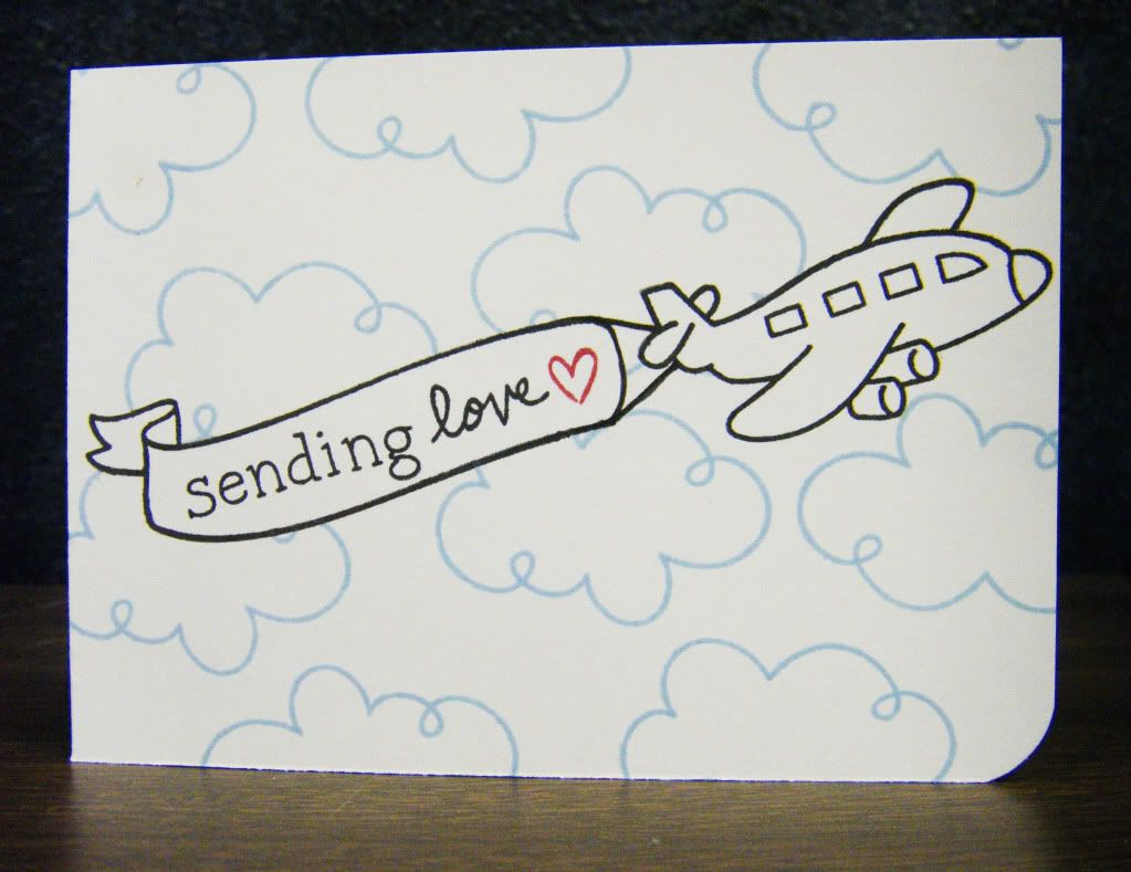
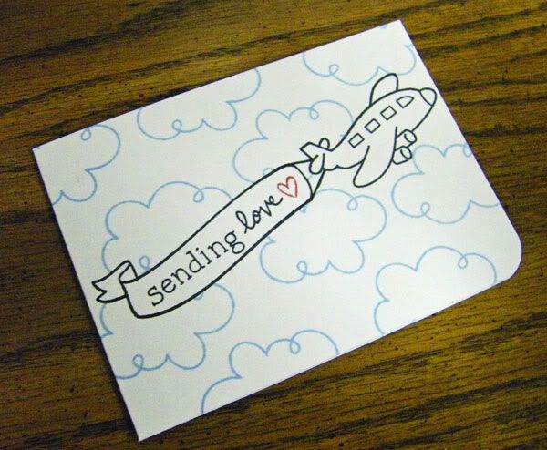
This card should have been a breeze and once I figured out exactly what I wanted to do, it was.  With full disclosure, I ended up making it 3 times.  The first time I used too heavy of a hand with the background and hearts.  The second time it turned out well with a simpler background and only one heart, but I didn't like the size of the card.  The last time was the charm.

I wanted to create a Valentine's card with the cute plane from Bon Voyage by Lawn Fawn and have a banner sign being pulled by it with a customized sentiment.  I love all of the abcs by Lawn Fawn as they are designed to make it easy to stamp any word or sentiment you desire.  I wanted to stamp "sending" so I used my Smitty's ABCs and paired that with the sweet "love" from Sophie's Sentiments (suggestion: if you are new to Lawn Fawn start with Sophie's Sentiments along with whatever other stamp sets catch your fancy) and then added a little heart from Cruising Through Life in red for a little interest and drama (in the future I may fill in the heart with stickles or just a marker or emboss it, but I wanted this card to be a simple stamp and ink card).  The banner is a two sided ribbon banner from Bannerific, but I wanted one side to be plain so I simply removed the ink from one edge of the inked up stamp and once stamped filled in the area with a marker as I wanted it and added the attachment to the plane.  I stamped the banner and plane first, then masked them off before stamping the cloud background.  Lastly, I rounded the bottom right corner.


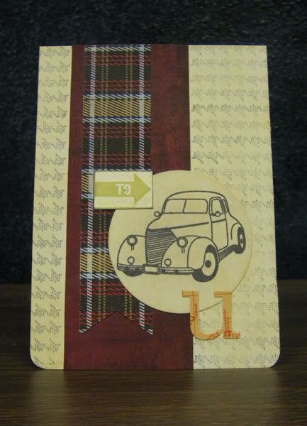
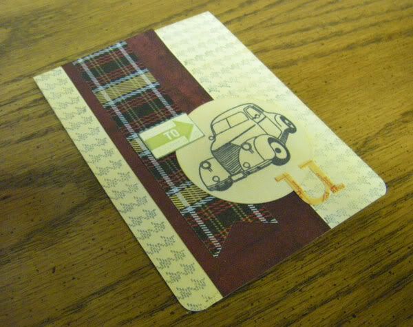
The second card I made uses one of the simple sketches by Kristina Werner.  I needed a masculine birthday card so I grabbed my Oxford 6x6 patterned paper pad by Basic Grey.  Stuck in there was a strip of the claret colored paper I had left over from a previous card so that was my jumping off point.  I began with a white card and stamped the Dash Pattern background stamp by Basic Grey/Hero Arts, but after adding the plaid strip of paper over the claret the white wasn't right so I colored all the white cardstock using my Antique Linen Distress Ink.  As my card is for a relative that has an interest in cars I used the vintage car from the Going stamp set by Hero Arts on a circle cut using a Spellbinders' die and also decided to also use the "to arrow" image in the set for further interest and to begin a sentiment.  I embossed the "to arrow" stamp and filled in the unembossed section with Shabby Shutters Distress Ink with white embossing powder, but since I changed the color scheme away from bright white I colored over the white embossed image with some Copic markers.  Usually I would have used some dimensional adhesive on a card, but I wanted to go away from my usual modus operandi (can you tell I have been reading some mystery novels?) on this card.  I added a "u" sticker from Studio Calico and rounded the bottom corners of the card.

Thanks for stopping by! 

Happy creating,
Shay.


{sending love card}
stamps: (sending)smitty's abcs, (plane&cloud)bon voyage, (heart)cruising through life, (love)sophie's sentiments; banner(bannerific), Lawn Fawn
ink: tuxedo black, Memento; soap powder & cough syrup, Jenni Bowlin for Ranger
cardstock: white, Georgia Pacific
marker: soft black memory marker, American Crafts
other: crop-a-dile corner chomper, We R Memory Keepers

{to u card}
stamps: (to arrow&car)going, Hero Arts; dash pattern, Basic Grey/Hero Arts
ink: tuxedo black, Memento; shabby shutter, antique linen & black soot, Tim Holtz Distress Ink by Ranger; weather vane, Jenni Bowlin for Ranger; versamark, Tsukineko
embossing powder: opaque white, Judi Kins
cardstock: white, Georgia Pacific
patterned paper: oxford 6x6 paper pad, Basic Grey
markers: Copic
die: from nesties classic & standard circles nestabilities set, Spellbinders
stickers: u from documentary collection alphabet stickers, Studio Calico
other: crop-a-dile corner chomper, We R Memory Keepers; cuttlebug, Provo Craft

LinkWithin

Related Posts with Thumbnails